Dark Mode
Contents
I tend to setup my machines with a fairly dark appearance, often using Dracula Theme or similar for my editor setup, terminal colors and so on. In fact I do
this for GTK and KDE, which means that Firefox also knows about my
preference for a darker visual appearance. Quite many most? websites still do
not take this into consideration and so I also find myself using Dark Reader a
lot to have more visual consistency across my internet browsing. Even
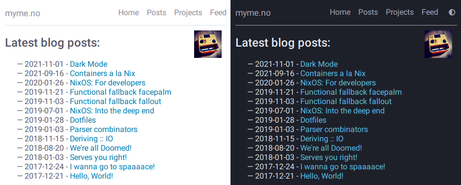
myme.no1 did not, until very recently, have a “dark mode”. This post is
about me fixing that!
If ever there is a topic defining bikeshedding2 “color schemes” (or palettes) has to be it. In the context of desktop environments, text editors, terminal emulators and other GUI applications customization start with the color scheme. A color scheme is perhaps the most elementary building block for an application theme, next to font selections, icon collections and geometric characteristics like rounded or sharp window corners, transparency and so on.
In more recent years an increased awareness of accessibility has provided a more functional justification for color variations as opposed to pure subjective aesthetics. By providing several carefully crafted color schemes and font face combinations a web site is not only able to accommodate a reader’s personal preference, but it can also greatly improve the experience for visually impaired individuals who might struggle with the legibility of certain color combinations, font sizes or contrast levels.
Accessibility
My own experience with colors as an accessibility concern is quite limited. I do not have much of a visual impediment myself beyond being unable to use a computer for extended periods of time without my modest prescription glasses. Neither was accessibility something I was purposely considering when wanting a “dark mode” for the site. Yet as I was researching around I did stumble on some resources and tools which I wanted to save for my future self or any reader whom might not be too familiar with this themselves.
The Web Content Accessibility Guidelines (WCAG) define calculations to compute
the contrast ratio between a font color against its background color, a
heuristic for how distinguishable text of a certain color is when overlaid
another background color. The minimum requirement (Level AA) of contrast is set
to 4.5 for most regular text:
The visual presentation of text and images of text has a contrast ratio of at least
4.5:1.
For larger or heavier fonts3 the contrast requirement is relaxed a bit, but
shouldn’t be below 3:1. For the enhanced success criterion a contrast ration
of 7:1 should be met.
Using tools like Contrast Checker it is possible to experiment with various
color combinations to see if your desired color combinations are considered
accessible enough. The style browser in the developer tools of both Firefox
and Chrome (-ium and variants as well of course) include contrast information
for the color value of the selected element:

I have not spent much effort tweaking the palette to be fully WCAG (enhanced) compliant, but already I’m quite happy with the results.
I was tipped about what seems like a very cool and useful accessibility tool over at https://www.experte.com/accessibility/contrast. It automates contrast checking and other accessibility concerns by scraping a URL (and sub-pages) and reporting all findings for each page. I haven’t extensively tested the tool myself, but doing a quick test run on my site it did rightfully report the elements I know did not 100% comply with contrast thresholds.
2023-07-27
Operating system support
Both desktop and mobile operating systems have acknowledged the need for
providing high level controls over the visual expression of the OS GUI
components. All major OSes, including iOS and Android as well as the main
Linux Desktop Environments like Gnome and KDE, provide toggles for
enabling “dark mode” or themes with a dark appearance.
Typically it’s a simple toggle switch between two possible values of light and
dark. Toggling the switch changes the default color scheme from the typical
dark foreground on light background to a light-on-dark color scheme. A light
foreground on a dark background will appear “darker” than the opposite, and
hence is mainly referred to as a “dark mode”.
Due to being visually “darker” than the regular light modes, dark mode color schemes are often preferred in low-light environments. For the same reason “night mode” is often used to describe them. For users who enjoy reading through the news or browsing blogs at bedtime the bright light from white backgrounds can feel uncomfortable to the eyes.
Applications are able to hook into the OS-level preference of “dark mode” and adjust the color scheme accordingly. Providing a dark variant of an app’s color scheme not only caters to a user’s general preference, it also helps smooth the transitions between apps that all respect the setting, keeping a consistent level of perceived light emitted from the device screen.
Automatic color scheme switching
I wanted a stylesheet for this site which could at least make automatic switching of color schemes based on the operating setting. Users who have configured their OS accordingly will now see a dark version of the site:
The first thing I had working was automatic selection of color scheme based on
browser preference. In other words, no user controlled overrides to force the
scheme to either light or dark. For automatic switching CSS exposes
primarily a media query to define rules to apply in the case of the operating
system (or browser) prefers either a light or dark scheme:
@media (prefers-color-scheme: dark) {
    /* Overrides ... */
}
CSS custom properties
For the most part it’s only color overrides that are needed when applying a dark
mode scheme and for my use-case there are not really any other custom CSS
rules required.
The simplest way to change all color values associated with page elements is to
use CSS custom properties. Custom properties can easily be overridden in
selectors with higher specificity, like the media query in the section above.
Another benefit of CSS custom properties is that they provide semantic naming
of values, which greatly improves the readability of the stylesheet in my
opinion:
/* Light mode default colors */
:root {
    --main-bg: #ffffff;
    --main-bg-dim: #ddddee;
    --main-fg: #555566;
    --main-fg-heavy: #333344;
    --main-fg-dim: #888899;
    --main-link: #0077aa;

    /* ... and so on */
}

/* Dark mode colors */
@media (prefers-color-scheme: dark) {
    :root {
        --main-bg: #1e2029;
        --main-bg-dim: #a1a1b2;
        --main-fg: #e5e9f0;
        --main-fg-heavy: #f8f8f2;
        --main-fg-dim: #a9a9b8;
        --main-link: #5ac5f2;

        /* ... */
    }
}

body {
    background-color: var(--main-bg);
    color: var(--main-fg);
    /* ... */
}
Custom properties in CSS are subject to the cascade and inherit their value
from their parent. Properties are bound to the scope of the selector in which
they’re defined and so it’s common practice to define them using the :root
pseudo-class selector to have them applied to the entire HTML document.
Manual color scheme switching
Although it’s nice to have a site that respects the users’ preference for
light vs. dark mode as expressed by the browser, I find that it would also
be interesting to investigate the possibility of a manual override. Perhaps
something similar to the OS toggle button:

CSS duplication
With just the automatic rules all specializations of the dark scheme could be
done within the @media query. For a manual override something in the document
itself must change for the browser to know which style to apply. This site is
statically generated and so I do not want any logic on the server side to
determine this. The simplest solution client-side is to use JavaScript and
store the preference field persisted in LocalStorage.
JavaScript has to change some attribute of the document to allow selectors
to properly apply light and dark styles. In this case the JavaScript is adding
a data-scheme attribute to the document root (<html>). Unfortunately though,
I’m not aware of any way of composing the media query with selectors on the data
attribute using vanilla CSS which makes some duplication unavoidable:
:root[data-scheme="dark"] {
    --main-bg: #1e2029;
    --main-bg-dim: #a1a1b2;
    --main-fg: #e5e9f0;
    --main-fg-heavy: #f8f8f2;
    --main-fg-dim: #a9a9b8;

    /* .. */
}

/*
 * (Duplicate :-( ) media dark colors
 */

@media (prefers-color-scheme: dark) {
    :root:not([data-scheme="light"]) {
        --main-bg: #1e2029;
        --main-bg-dim: #a1a1b2;
        --main-fg: #e5e9f0;
        --main-fg-heavy: #f8f8f2;
        --main-fg-dim: #a9a9b8;

        /* .. */
    }
}
This is quite unfortunate, as I’ve already been bitten by forgetting to update
color values in one of the two places the dark colors are defined. This can
somewhat be remedied by introducing yet another level of CSS custom property
indirection. Also, throwing something like sass mixins on the problem would
help reduce the duplication, but that would mean adding additional tools to the
building of the site.
Dynamically changing color scheme
For those who’ve already tried the manual switcher or who looked closely at the
animation above would notice that the toggle switch has three states, and not
just two. One thing that can be a problem with user overrides is that it’s often
easy to forget that once a preference has been set, there’s no way to return to
the default behavior. I did not want to end up in a situation where users are
unable to return to the default automatic switching behavior if they ever
pressed the toggle button. For this reason the button is a three-state toggle
where it cycles from auto to either light or dark then eventually back to
auto.
Depending on the browser scheme preference the order in which the cycle rotates
through the schemes changes. If the media query returns that light is the
preferred scheme then it makes sense for the next state to be the dark scheme.
Conversely, if the media query detects a preferred scheme of dark then the
next state should be the light scheme.
Finally, the last state before the toggle loops around is the same scheme that is detected as the preferred. This is so that it’s possible to “lock” the scheme to the same value as the media query detects, because this global preference might be changed at some later time while the user wishes to retain the specific scheme for the site.
Here is the implementation of setThemeExplicitly() which drives the logic
behind the toggle switch:
const schemeMedia = window.matchMedia('(prefers-color-scheme: dark)');

function setThemeExplicitly() {
  const themeOrder = schemeMedia.matches
        ? ['auto', 'light', 'dark']
        : ['auto', 'dark', 'light'];

  const storedTheme = localStorage.getItem('theme');
  const themeState = themeOrder.includes(storedTheme) ? storedTheme : 'auto';
  const nextState = (() => {
    let current;
    do {
      current = themeOrder.shift();
      themeOrder.push(current);
    } while (current !== themeState);
    return themeOrder.shift();
  })();

  localStorage.setItem('theme', nextState);
  setThemeUIState();
}
Most of the logic is concerned with finding the next state based on which scheme
is the preferred scheme matched by a matchMedia() query and whatever
preference the user has explicitly set. When the next state has been determined
it’s also written to LocalStorage for persistence between page loads.
Apply manual overrides on page load
On a new page load the JavaScript must query the LocalStorage to check if
the user wants an override of the automatically detected scheme. Based on this
the override button icons are set to match the current scheme and the
data-scheme attribute is set on the page root element. The following function
is run on the DOMContentLoaded event:
function setThemeUIState() {
  const themeState = localStorage.getItem('theme') || 'auto';
  const icon = {
    light: 'sun',
    dark: 'moon',
  }[themeState] || 'adjust';

  themeIcon.className = `fas fa-${icon}`;

  if (themeState === 'auto') {
    delete root.dataset.scheme;
  } else {
    root.dataset.scheme = themeState;
  }
}
Flicker & transitions
Animating the transition between dark and light mode feels a lot easier on the
eyes, even with a rather short animation duration. By defining a transition
property on most of the page elements the browser will automatically tween4
to the new color value:
body.transitions, body.transitions * {
    transition:
        color .5s linear,
        background-color .5s linear;
}
Although this transition rule works well once the page has loaded it does cause quite a bit of problems on the initial page load. When using the automatic scheme selection based on the media query from the last section there is no problem. Likewise there would have been no issue had the theme been determined server-side through the use of cookies or other session-related state.
Client-side the browser will apply the default styles regardless until the
JavaScript code to read the LocalStorage and apply the overridden scheme
gets to run. Once the JavaScript detects that the scheme should be switched it
changes the data- attribute on the root element causing the colors to flip to
the correct ones. This causes an unpleasant flicker that’s hard to avoid should
the JavaScript on the site be evaluated slowly.
Even worse is with the transition rules enabled the colors changing from the default to the selected scheme will trigger an animation. This causes a very sluggish and unpleasant experience of transitioning colors while the page is being rendered. Can’t have that.
To avoid this issue entirely it’s possible to serve the original document
without a transitions class on the <body> element and add it at some point
later from JavaScript. The downside is that transitions won’t be enabled for
users without JavaScript, which might not be much of a loss as the only way
for them to trigger a scheme change would be through the browser’s preferred
scheme. This is typically done from a modal or settings screen which means the
user isn’t actively looking at the document to notice the transition (or lack
thereof) in the first place.
The wrong long way
I first went down the rabbit hole of trying to have transitions enabled by
default, disable them from JavaScript by removing the transitions class from
<body> during load, then add it back again later. This caused a bunch of
trouble.
Firstly, when should the class be added back?
I’m often seeing the transition effect while running the development server and
it seems that if the class is added back too soon the transitions will come back
into effect. Or it could be that DOM changes aren’t happening strictly in the order
of the code. For all I know it might be browser issues.
While I did test various approaches, one fun one in particular which seemed to
work decently was to try to calculate at which time the transition would have
finished, and add back the transitions class at that point.
This uses a somewhat horrible helper function which creates a temporary element
with transitions enabled simply to read the style property from JavaScript,
parse it and wait for the largest transition amount of time to re-apply
transitions:
(async function waitToEnableTransitions() {
  const el = document.createElement('div');
  el.className = 'transitions';
  document.body.appendChild(el);

  try {
    const duration = Math.max(
      ...getComputedStyle(el)
        .transitionDuration
        .split(',')
        .map((x) => parseFloat(x) * (x.match(/ms$/) ? 1 : 1000)));

    await sleep(duration);
  } finally {
    document.body.removeChild(el);
    document.body.className = 'transitions';
  }
})();
sleep() by the way is this amazingly useful little thing:
const sleep = (timeout) => new Promise((resolve) => {
  setTimeout(resolve, timeout);
});
Now what does this abomination attempt to do?
- Create and insert a temporary
<div>element into the document. - Find all computed style properties of the element through
getComputedStyle(el). - The
transitionDurationproperty is extracted from the set of styles. - Split the transition duration values on comma using
split(','). - Each transition duration is then parsed for a floating point number duration
value and normalized to
milliseconds. - Find the largest value with
Math.max(). - Sleep for the
durationbefore applying transitions and removing the temporary element.
Since CSS <time> supports two units, seconds and milliseconds, and the
transitionDuration values aren’t normalized to one of them when read, the
final step converts second values into milliseconds through simple
multiplication.
The result of the chain of operations on transitionDuration is an Array of
duration values. In order to get the biggest (longest) duration, the ... splat
operator is used to pass all the values to the Math.max() function which
computes the largest value.
The reason the element has to be in the document before getting the transition
values is that any non-visible element will have empty transition values,
causing the computed duration to simply be 0.
The right way?
Instead of disabling transitions when we don’t want them we could try to
enable them when we do. For this to work the transitions class must be added
back whenever the color scheme will change. This can happen in on of two ways:
- The browser preferred scheme changes.
- The users presses the toggle switch.
Fortunately the browser provides us with events for both of these cases, and here is the code:
const schemeMedia = window.matchMedia('(prefers-color-scheme: dark)');
const themeBtn = document.querySelector('button.scheme');

schemeMedia.addEventListener('change', () => {
  document.body.className = 'transitions';
  setThemeUIState();
});
setThemeUIState();

themeBtn.addEventListener('click', () => {
  document.body.className = 'transitions';
  setThemeExplicitly();
});
The first even listener is hooked up to the change event of the matchMedia
query. The second is of course a regular button click event. Undeniably it’s
quite lot easier to reason about this code and it serves the purpose well.
Conclusion
It’s been very engaging to play around with color scheme support and to find all the quirks and strange behavior that makes such a seemingly trivial feature harder to get right than first expectations. It’s not very appealing to have web sites that are unnecessary busy during load, and especially with big flickers between light and dark, as well as unnatural transitions.
The implementation of manually switched schemes with transitions is by no means flawless and so it would be interesting to know how these kind of issues have been solved by others elsewhere.